http://www.caida.org/research/policy/geopolitical/bgp2country/pics/population.png
The Lorenz Curve is a graph that shows distribution of wealth. This graph shows distribution of GDP and IP addresses across the world population.
Sunday, December 5, 2010
Correlation Matrix
http://seekingalpha.com/article/97777-don-t-pull-out-of-the-markets-diversify-into-uncorrelated-assetsA correlation matrix shows a correlation between many variables. This graph shows the relationship between stock products.
Index Value Plot
http://ddo.typepad.com/An index value plot is a visualization map that is plotted on a line graph. This graph shows a company's financial index year by year.
Scatterplot
http://psyc.queensu.ca/~frostlab/sun98.htmlHere is a scatterplot that uses velocity and stopping distance as variables. This scatterplot shows the initiation of braking points.
Star Plot
http://www.answers.com/topic/spider-plot
This star plot shows the numbers of farms of different types in different regions of England. There are many cattle and sheep farms in the South-West, whereas cereal farms predominate in the East.
This star plot shows the numbers of farms of different types in different regions of England. There are many cattle and sheep farms in the South-West, whereas cereal farms predominate in the East.
Climograph
http://www2.volstate.edu/kbell/climographs.htmA climograph plots monthly average temperature and precipitation for some location. This graph shows temperatures and precipitation for Manaus, Brazil.
Windrose
http://en.wikipedia.org/wiki/Wind_roseThis plot shows how wind speed and direction are typically distributed at a particular location. This windrose plot is of the LaGuardia airport in New York, NY.
Triangular Plot
http://www.lithoprobe.ca/media/slideset/slides/tools20.asp
This is a triangular plot displaying differences between three variables. This image is used to plot the chemical analysis of igneous rocks.
This is a triangular plot displaying differences between three variables. This image is used to plot the chemical analysis of igneous rocks.
Parallel Coordinate Graph
http://peltiertech.com/WordPress/composite-baseball-player-evaluation/Here we have a parallel coordinate graph showing many variables. This map is of baseball players statistics and percentages of overall played games.
Histogram
http://election.princeton.edu/todays-electoral-vote-histogram/Here is a histogram of the electoral vote between McCain and Obama. Probability distribution of all possible outcomes calculated from current state polls. The central dark blue bars represent the 95% confidence interval. The tails are plotted in green.
Box Plot
http://www.obermatt.com/knowledge/indexing/percentiles/Here is a box plot of a company named Obermatt. This box plot shows their company sales growth.
Stem and Leaf Plot
http://www.eduplace.com/math/mhm/5/06a/index.htmlThis Stem and Leaf plot show quantitative data in a graphing form. This graph shows ages of people at a family reunions.
Nominal Area Choropleth Map
http://www.opentopography.org/index.php/blog/detail/lidar_for_the_northeast_project_fundedThis is a nominal area choropleth map that shows a proposal for an extensive Lidar collection of coastal regions of the Northeaster U.S. It displays nominal data.
Unstandardized Choropleth Map
http://www.injusticeeverywhere.com/?p=3333This unstandardized choropleth map displays the amount of police misconduct incidents across the United States. It displays the incidents as the number reported for each area.
Standardized Choropleth Map
http://www.statcan.gc.ca/pub/92f0138m/2008003/figures/5200001-eng.htmThis is a standardized choropleth map of people 14 years of age and under in Canada. This map shows distribution among different areas.
Univariate Choropleth Map
http://www.clearlyandsimply.com/clearly_and_simply/2009/06/multicolored-choropleth-maps-with-excel.htmlHere we have a map with only one variable. The colors represent pop, soda, coke or other. The map displays what each state calls a soda beverage.
Bivariate Choropleth Maps
http://rkpjrhist615.wordpress.com/category/geography-310/This Bivariate Choropleth map displays two variable on this one map. First variable is total persons with disabilities ages 21 to 64 and the second variable is the unemployment rate per county.
Unclassed Choropleth Maps
http://math.yorku.ca/SCS/Gallery/milestone/thumb5/popup/bssn1_popup1-19.htmThis is an unclassed choropleth map with shadings from black to white. This map shows the distribution and intensity of illiteracy in France.
Classed Choropleth Maps
http://jeffline.jefferson.edu/aisrnews/?p=356Here is a classed choropleth map of people 65 and over in Philadelphia. This map uses shading and color intensity to identify classes.
Range Graded Proportional Circle Map
https://www.e-education.psu.edu/natureofgeoinfo/book/export/html/1553Here we have a range graded proportional circle map of the Hispanic population as a percentage of the total population.This circle map depicts the circles in relation to ranges of data.
Continuously Variable Proportional Circle Map
http://pubs.usgs.gov/fs/fs-004-03/Here is a continuous variable proportional circle map of river characteristics.The area of the circle is proportional to the channel width. The color of the large circle approximates the color of the water. Descriptions of the bed material are determined by the position of the solid black circle within the black triangle.
DOQQ

Digital Elevation Model
http://www.ouachitamaps.com/Butterfield.htmlThis is a digital elevation model of the Butterfield Trail at Devils Den. It is named for the Butterfield Overland Express stage coach route and offers a rugged overnight hike in the Ozark Plateau. It begins at Devils Den State Park and loops southward into the Ozark National Forest.This DEM shows that route.
Digital Line Graph
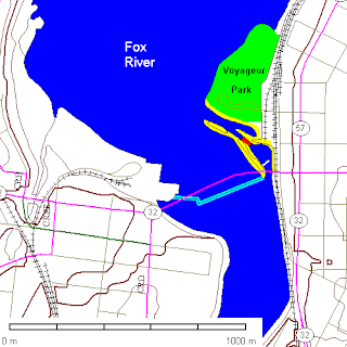
http://www.uwsp.edu/geo/projects/geoweb/participants/dutch/geolwisc/geostops/DePere.HTTM This is a DLG of the Fox River. The Fox River once had numerous rapids formed by ledges of the Sinnipee Group dolomites. These later became locales for dams, but surprisingly, outcrops are still evident at a number of them. The dams also had locks, but commercial shipping on the Fox River has ceased and only recreational boaters use the locks. The rapids here gave their name to the city of De Pere, which straddles the river.
DRG
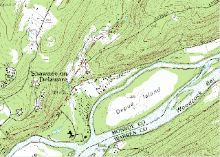
https://www.e-education.psu.edu/natureofgeoinfo/c6_p6.html Here we have a DRG map for Bushkill, PA. DRGs are created by scanning paper maps at 250 pixels per inch resolution. Since at 1:24,000 1 inch on the map represents 2,000 feet on the ground, each DRG pixel corresponds to an area about 8 feet (2.4 meters) on a side. Each pixel is associated with a single attribute: a number from 0 to 12. The numbers stand for the 13 standard DRG colors.
Isopleths
http://www.envisci.ucr.edu/ensc176/es176_2003/ENSC_176_Summer_2003.htmlThis Isopleth map is of CO2 concentrations along a tree-kill perimeter. Soil CO2 concentrations as high as 100% by volume were recorded, and the highest concentrations coincided well with the central area of the tree-kill area.
Isopach
http://www.soton.ac.uk/~imw/Durlston-Bay-Peveril-Point.htmThis Isopach map is of southern England and the English channel. The contour lines are for total Purbeck Formation thickness and are in feet.
Isohyet
http://www.virginiaplaces.org/climate/index.html
This Isohyet map shows lines of equal precipitation for Virginia's climate. It shows precipitation patterns of the Blue Ridge mountains.
This Isohyet map shows lines of equal precipitation for Virginia's climate. It shows precipitation patterns of the Blue Ridge mountains.
Isotachs
http://www.websters-online-dictionary.org/definitions/weather+map?cx=partner-pub-0939450753529744%3Av0qd01-tdlq&cof=FORID%3A9&ie=UTF-8&q=weather+map&sa=Search#958
This Isotach map is a surface weather analysis of the United States in October of 2006. This map shows analyzing lines of equal wind speeds.
This Isotach map is a surface weather analysis of the United States in October of 2006. This map shows analyzing lines of equal wind speeds.
Isobars
http://www.windfinder.com/news/2010/09/new-map-type-isobars-clouds-an.htmlHere is an Isobar map of Europe. The grey colors indicate cloudy areas, whereas the blue, green, yellow and red colors indicate areas with rain. You can use this map to get a better picture of the general weather situation.
LIDAR
http://www.sciencegl.com/Archeology/Archeology_lidar.htm
Here we have a LIDAR data visualization. This image shows data with flood model overlain showing the relationship with Prehistoric and Roman settlement pattern overlain in blue vectors.
Here we have a LIDAR data visualization. This image shows data with flood model overlain showing the relationship with Prehistoric and Roman settlement pattern overlain in blue vectors.
Doppler Radar
http://www.stuffintheair.com/Doppler-radar-weather.htmlThis Doppler radar image is of the environment in Canada. This image use a computer program to color code the output for atmosphere diagrams. A table of colors, called a Velocity-Azimuth Display (VAD) appears on the right side of the example below. It helps the user interpret these values and the images.
Black and White Aerial Photo
http://pubs.usgs.gov/of/1995/of95-017/
This is a black and white aerial photo of Pearl Harbor region on Hawaii. This photo shows where material disposal sites have left a distinct imprint on the sea floor.
This is a black and white aerial photo of Pearl Harbor region on Hawaii. This photo shows where material disposal sites have left a distinct imprint on the sea floor.
Infrared Aerial Photo
http://www.nps.gov/lyjo/naturescience/naturalfeaturesandecosystems.htmThis infrared aerial photo is a map of the Lyndon Johnson National Historical Park shows two separate districts, each lying in the Pedernales River Valley, which cuts through a geologic region known as the Llano Uplift. The area is characterized by hills covered with ashe juniper and various species of oak.
Cartographic Animation
http://www.3dnworld.com/gallery.php?user=CHansonThis cartographic animation shows a 3D view of Mount Saint Helen. It uses contour lines to represent land forms.
Statistical Map
http://xenlogic.wordpress.com/2009/04/11/atheism-exposed-pragmatism/This map shows statistics of atheism in Europe. According to the map France has the highest percentage of people who disclaim any belief in God or any supernatural power.
Cartogram Map
http://maps.grida.no/go/graphic/world_economy_cartogram
This Cartogram map sizes the countries according to their relative financial status. Countries such as China and India become much smaller, next to giants in Western Europe, North America and Japan.
This Cartogram map sizes the countries according to their relative financial status. Countries such as China and India become much smaller, next to giants in Western Europe, North America and Japan.
Flow Map
Here is a traffic flow map that shows where they are opening a new bridge. This map was created to help drivers, transit users, bicyclists and pedestrians get around.
Isoline Map
http://www.grossmont.edu/judd.curran/outline1.htmHere is an Isoline map with continuous lines joining points of the same value. This map displays landforms in the United States.
Proportional Circle Map
http://www.neiu.edu/~ejhowens/377/examples.htmThis proportional circle map shows data in relation to the size of circles. The larger the population of Mexicans in that area the larger the circle.
Choropleth Map
7http://courses.washington.edu/info424/Labs/ChoroplethMap.html
Here is a choropleth map that shows a one year forecast change in jobs. This map uses shading and percentages to classify each state.
Here is a choropleth map that shows a one year forecast change in jobs. This map uses shading and percentages to classify each state.
Dot Distribution Map
http://walmartwatch.com/blog/archives/new_map_details_wal_marts_land_use_practices/
This is a map of Wal-Mart land usage. With more than 4,000 units in the United States alone, Wal-Mart controls an enormous amount of real estate. A new map, compiled by researchers at Wal-Mart Watch, profiles most of the existing and planned Wal-Mart stores and Supercenters across the United States.
This is a map of Wal-Mart land usage. With more than 4,000 units in the United States alone, Wal-Mart controls an enormous amount of real estate. A new map, compiled by researchers at Wal-Mart Watch, profiles most of the existing and planned Wal-Mart stores and Supercenters across the United States.
Propaganda Map
http://angrywhitedude.com/?tag=texasThis is a map from the 2008 election between McCain and Obama. At first glance you may assume that McCain won because it appears to be more red than blue.
Hypsometric Map
http://www.trailcanada.com/canada/map/relief/
This map shows relief in Canada. Relief is depicted with twelve hypsometric tints. Eight colors are used to indicate the ocean floor levels or bathymetry.
This map shows relief in Canada. Relief is depicted with twelve hypsometric tints. Eight colors are used to indicate the ocean floor levels or bathymetry.
PLSS MAP
http://www.nationalatlas.gov/articles/boundaries/a_plss.htmlThis public land survey system map divides and describes land in the United States. This map divides up principal meridians and base lines.
Cadastral Map
http://epg.modot.mo.gov/index.php?title=751.0_state_map
This cadastral map shows boundaries within a state. This is a Missouri state map that shows county codes and district numbers.
This cadastral map shows boundaries within a state. This is a Missouri state map that shows county codes and district numbers.
Thematic Map
http://www.bostonstudies.com/thematic-maps.html
This thematic map was created in 2006 for Boston Planning Districts. Shading represents the classification of median household incomes.
This thematic map was created in 2006 for Boston Planning Districts. Shading represents the classification of median household incomes.
Topographic Map
http://www.psfk.com/2008/08/make-your-ouw-free-customizable-topographic-maps.htmlHere is a topographic map of surrounding areas by Pilarcitos Lake. This map has contour lines that represent points of the same altitude.
Planimetric Map
http://www.fws.gov/northeast/wetlands/overview_nwi.htmlHere is a National Wetland Inventory planimetric map. This map covers the wetland area around Milton, DE.
Mental Map
http://krygier.owu.edu/krygier_html/geog_222/geog_222_lo/geog_222_lo13.html This is a mental map of a young student in Thailand. This is his view of the continents based on what he remembers from his experience of viewing maps of the world.
Subscribe to:
Comments (Atom)


